WA Single-use Bag Ban Flyer
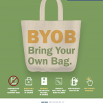
Today is the first day of the Washington state single-use bag ban. So say your goodbyes to this majestic trash bird that floats through our skies, sails through our seas, and clogs up our drains. We were happy to work with the Washington State Department of Ecology and Seattle Public Utilities to produce some materials … Continued