Poster: Egypt vs Iran + Pride Match!
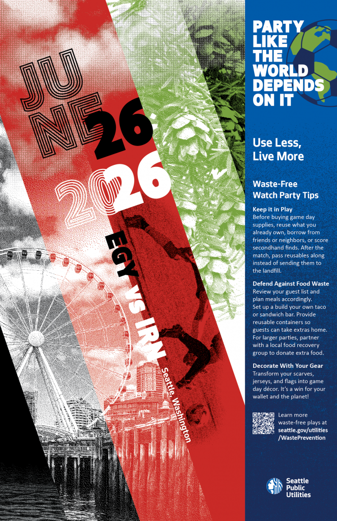
Poster #4 plus a Pride Match Alternate of the series. Today’s poster shows the Iran and Egypt flag stripes, paired with Seattle ferris wheel, soccer players, and western hemlock (WA’s state tree). What a nice coincidence that Egypt and Iran’s flags each have three stripes and the Pride flag has six. The Pride match version … Continued