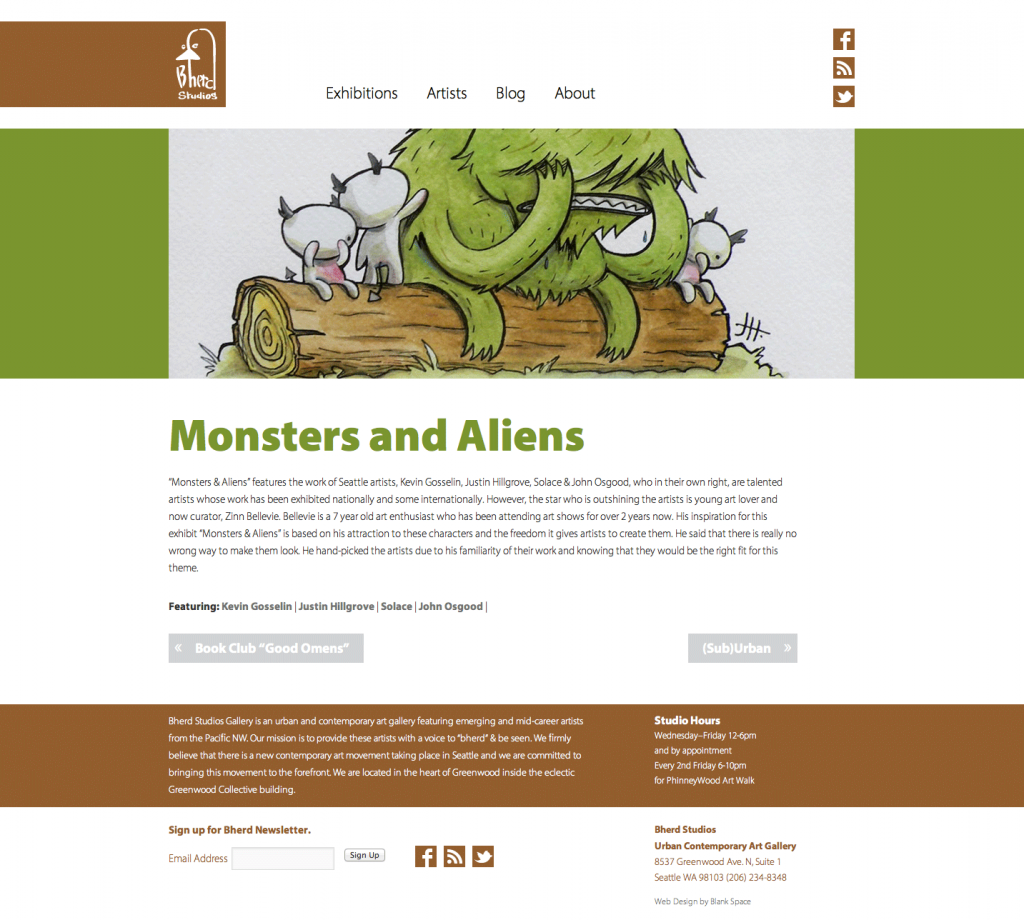
Website Design Showcases Bherd’s Exhibitions & Partnerships
John and Michele Osgood make owning a business with your spouse look easy. John’s artistic attention to detail and Michele’s marketing smarts balance one another perfectly. Together they created Bherd Studios—pronounced Be Heard—it is a contemporary gallery featuring emerging artists.
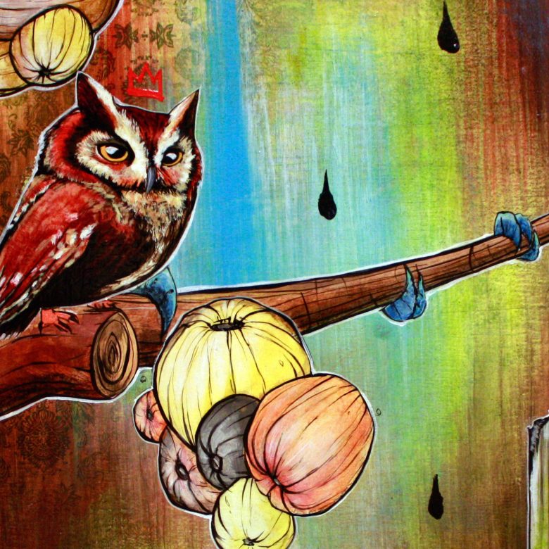
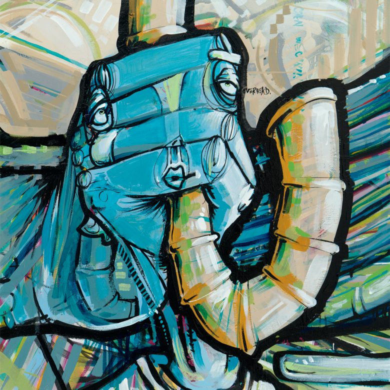
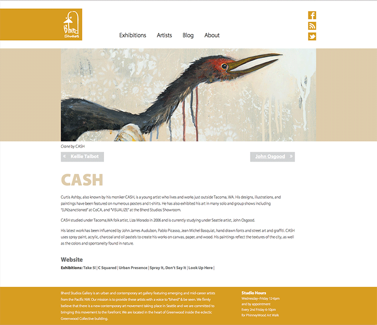
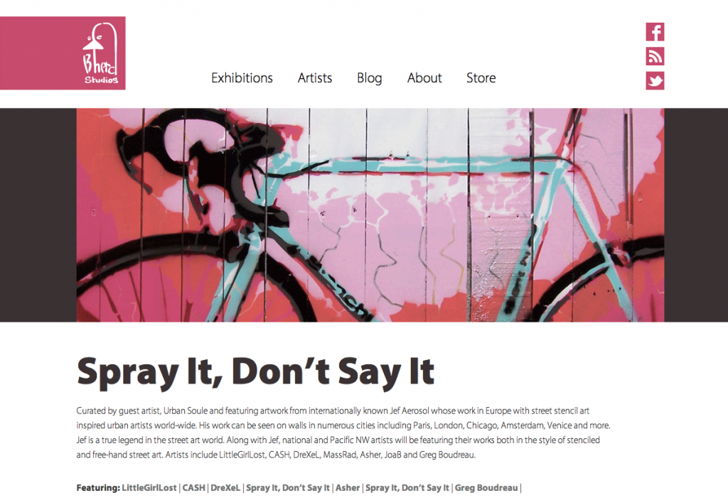
The website design captures the vibrant art and high energy that flows through Bherd Studios. The website pairs fixed graphics with a customizable color palette. This allows each exhibition to have its own color palette. The variance in colors keeps Bherd’s website fresh and fun like the art they represent.
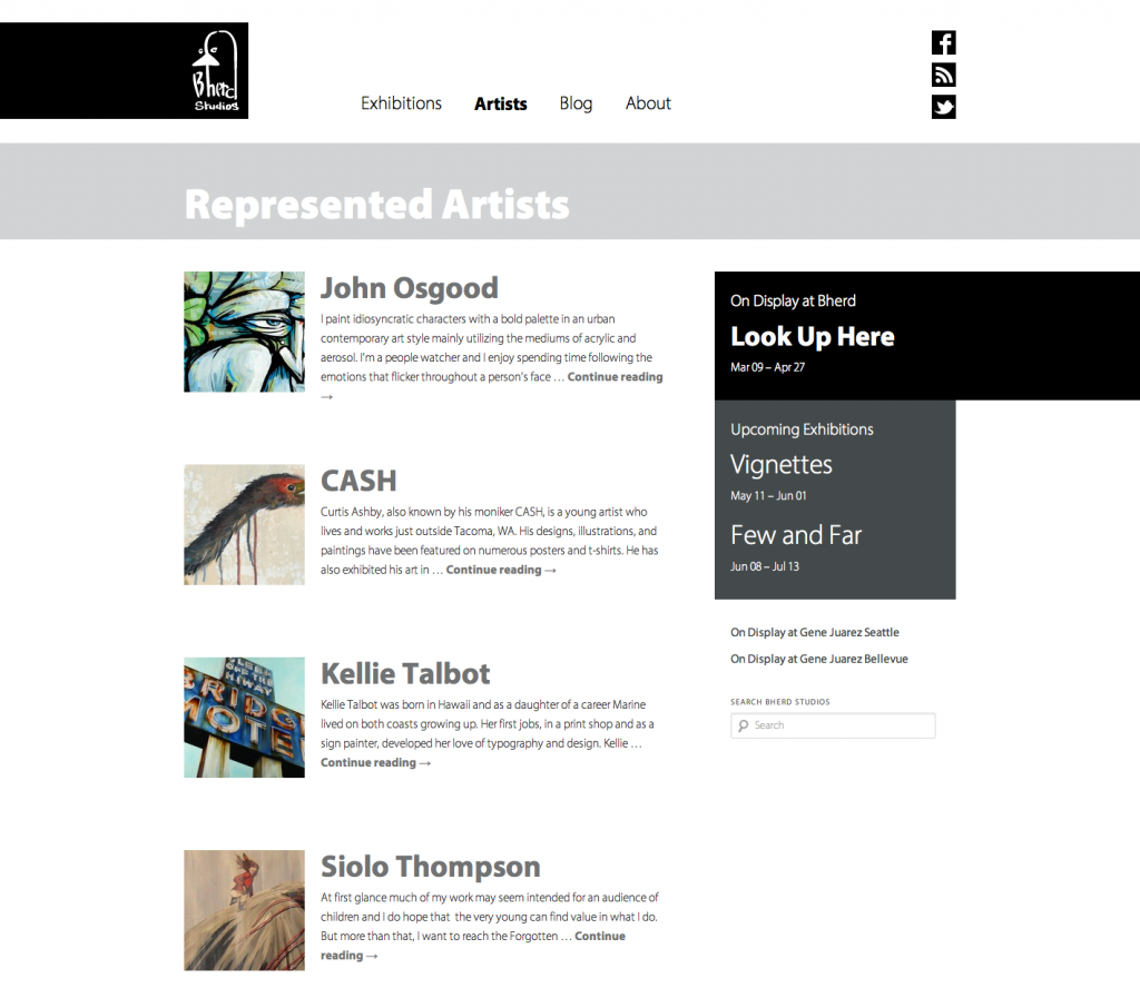
Customized Content Management System
The website is built with the WordPress platform. We help organize their content and customized the WordPress content management system to fit their specific needs. For example, each artist they represent can be added and paired with specific exhibitions. This gives Bherd an online database of artist and exhibitions that can be easily maintained and regularly updated.
Bherd works hard to support local artists and facilitate an environment for creative collaboration. We look forward to seeing the many creative talents Bherd Studios will nurture and present to the Seattle art scene for years to come.
Mindi and Riley took the time to listen to what we envisioned. Blank Space gave us the facelift we were looking for and matched the professional yet playful feel that we wanted for Bherd.
—Michele Osgood, Gallery Director & Owner
BeHerdStudios.com
