Sound Transit Pictograms

Wayfinding offers the designer an opportunity to reference the history, culture, and essence of place in an immediate way that will be seen and used on a daily basis. An effective wayfinding system can be a visual ambassador, a means of saying “Welcome, let me help you find your way around and enjoy yourself.” — Lance Wyman

pictograms-design-seattle-transit-light-rail

Sound Transit is connecting the Puget Sound region with buses, trains, and light rail. The Link light rail currently provides service from Sea-Tac airport to downtown Seattle and is expanding with 6 new stations by 2021. To aid non-English-speaking riders, each station is represented by an icon. Blank Space is proud to have worked with Sound Transit to design icons for these new stations.
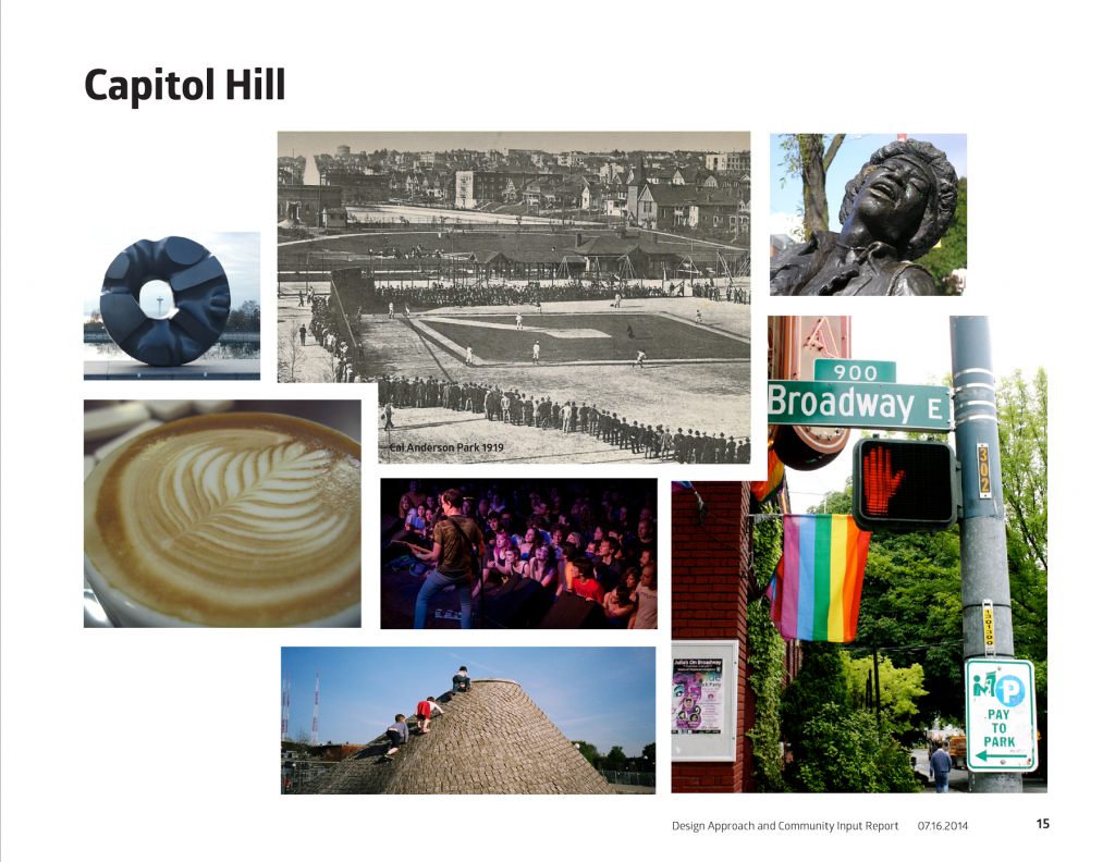
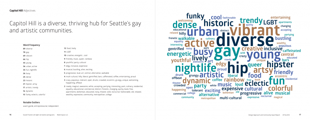
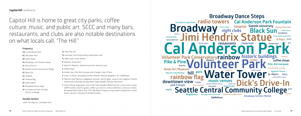
Sample pages from the Community Input report for the Capitol Hill neighborhood. Through online surveys seattle residents shared what adjectives and landmarks reminded them of different neighborhoods.

Image collage of capitol hill neighborhood in Seattle Wa

Seattle is a city of unique neighborhoods and people have pride in their part of the city. This is why we began this design process with research and surveys. The icons have a practical purpose for speakers of other languages, but they also represent the places in our city for all citizens. Sound Transit administered surveys to get a sense of what landmarks and images people associate with the area around each new station. We scoured through the responses and organized the data. As we read the responses we could see clear trends emerge for each neighborhood.

One amusing result was that some people listed Mount Rainier as a landmark for almost every station. Mount Rainier is so massive, beautiful, and compelling that everyone feels like their view of it is truly special. But, unfortunately, all of the icons can’t be mountains.

Upon conclusion of the research we created a document to give an overview of the surveys. We grouped similar responses and listed them in order. We created word clouds that could communicate the results at a glance. This document guided our design process throughout the rest of the project and it still affects the way we see Seattle today.

Cloud bubble graphic for words that represent the Capitol Hill neighborhood in Seattle, WA (diverse, vibrant, hip, gay, historic, etc)
Sample spread from community report with words that represent the Capitol Hill landmarks in Seattle, WA (cal anderson park, broadway, water tower, volunteer park, etc)

Designing the Pictograms

The first concepts were just ideas represented by different images–not yet iconic. We wanted to find out which images would be the most effective at connecting with residents and also which images could be recognizable at very small sizes. We gave ourselves room to explore and change each icon because there’s more that one way to draw a trout.

At each step of the design process we narrowed our focus. Together with Sound Transit we made decisions about which concepts to pursue. Once we limited our options for each station, we began to draw. We drew dozens of variations on each concept. Should a flag angled or upright? Should we show a full moose or just a head? What does each variation communicate? How clearly can it be seen?

As we explored the forms of each concept we thought more and more about the constraints of the project. The main constraints we faced were size, color, the existing icons, and politics. The icons need to be legible at a quarter inch square. They needed to be black and white without gradients and, ideally, reversible. They also needed to be compatible with the existing thirteen icons. Lastly, there were political constraints and we all know it’s not polite to talk politics.

Six pictograms—dragonfly, moose, books, mortarboard, pride flag, and trout—created for the Light Rail for Sound Transit.

Final Pictogram Designs

After several rounds of revisions Sound Transit selected the final icons (pictured below). A dragonfly for Northgate, a trout for Angle Lake, a moose for Roosevelt, books for the U District, a mortarboard for the University of Washington, and a pride flag for Capitol Hill. We refined their forms and delivered high quality artwork for use on signage, maps, and online.

The first of these new stations will open in 2016.

We already loved riding the Link light rail to the airport, but soon it will be even more integrated into the city. We are proud of our contribution and can’t wait to see all of the new icons in action.