Downtown Spirits & Esquin

logo for downtown spirits and sequin co-brands

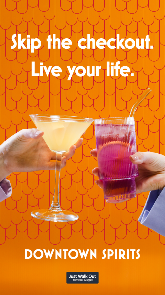
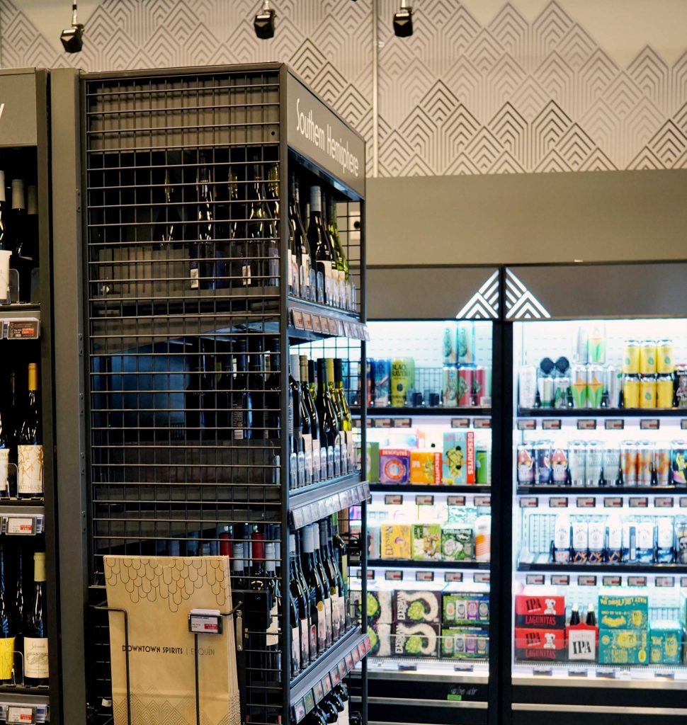
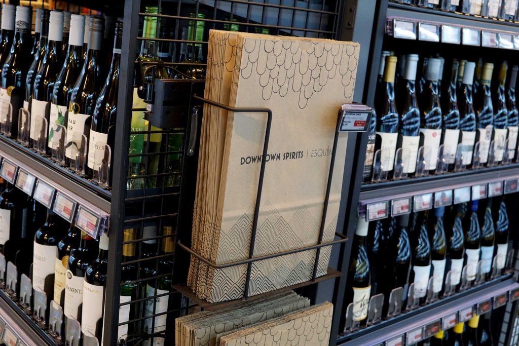
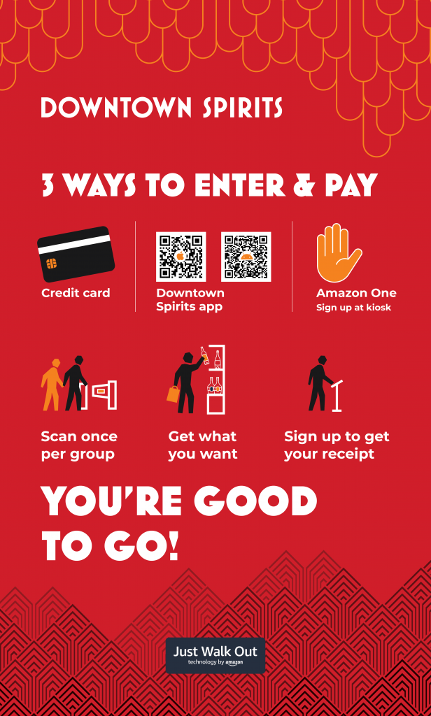
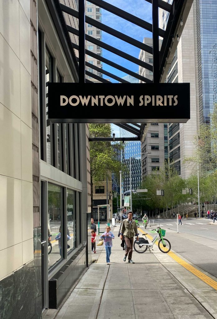
Downtown Spirits has been the premier location for beer, wine, and spirits in downtown Seattle for over a decade. In 2023, they began some exciting changes. First, a move to their new location at seventh and Stewart. Next, they became pioneers in offering the first-ever checkout-free beer, wine, and spirits shopping experience using Amazon’s cutting-edge Just Walk Out technology. Finally, Downtown Spirits acquired Esquin Wine & Spirits, Washington state’s oldest independent wine merchant.

With so many changes on the horizon, proprietor Marques Warren saw the opportunity to refresh and unite the Downtown Spirits and Esquin brand identities. When Marques reached out to us we were immediately excited for the project. We had experience working together years prior and knew Marques to be a client with an appetite for interesting and thoughtful design solutions.

Brand Strategy and Identity Design

Downtown Spirits and Esquin both have long relationships with their customers. Esquin was founded in 1969! We created a brand update that honors that history and maintains the character of each brand. All while creating a cohesive visual experience.

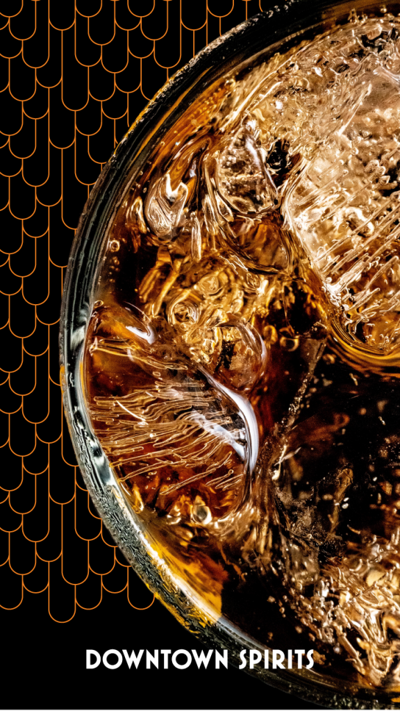
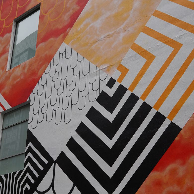
Our goal was to create refreshed logotypes for each brand that were distinct yet integrated. An extensive review of typography lead us to a typeface that could represent both the bold art deco references of Downtown Spirits and the elegant geometry of the Esquin mark. We found the perfect fit with the Mostra Nuova. It has incredible range, it can be delicate and sophisticated, funky and loud, and anything in between.

The Downtown Spirits and Esquin brands are designed to coexist and support one another. Each brand identity has its own strengths and characteristics. The identity design systems may be used together or independently, depending on the context. 

Cohesive Co-branding Color Palette Design

We had clear goals when developing the brand color palette. We wanted a red to represent Downtown Spirits and an orange to represent Esquin. These colors would help connect the updated brand to the previous identities. The secondary colors create a bridge between Downtown Spirits and Esquin. Both brands share the same palette but have different emphasis to create a distinct feeling for each.

Art Deco Inspired Graphics

Our research of all things art deco had us falling in love with geometric patterns. The versatile brand elements span different uses and messages. We developed dozens of patterns before selecting two. One pattern is angular and creates a mountain effect, the other is drippy, circular, and cloud-like. When used together these patterns illustrate the landscape of the Pacific Northwest. Sometimes the repeating patterns are full backgrounds for a wallpaper effect. We worked on the interior environmental graphics for the Downtown Spirits flagship store. You will see these patterns applied as large graphics on the walls, interior signage, and on digital displays throughout the store.


Environmental graphic design helping customers know to bag as they shop at downtown spirits.

Sub-brands within the Identity Design System

Downtown Spirits and Esquin both have sub-brands that we needed to consider and develop. Downtown Spirits has branded co-op and wholesale programs. For these sub-brands we developed badges that can stand alone or be paired with the Downtown Spirits logotype.

rewards program co-op logo design

The CO-OP rewards club logotype may be used with Downtown Spirits or as a stand alone graphic element. CO-OP members receive exclusive discounts on hand selected wine and spirits.

Downtown Spirits Wholesale is an another sub-brand of Downtown Spirits. The program simplifies alcohol purchasing for bars and restaurants. A wholesale account allows business owners to consolidate vendors and invoicing.


Downtown Spirits Wholesale logotype

The Downtown Spirits Wholesale badge can be used as a stand alone graphic and applied as a sticker to the wholesale packages to their customers.

Esquin & MadWine Brand Refresh

Esquin is Seattle’s oldest and largest family-owned wine store. The brand refresh honors Esquin’s legacy while also creating a system that unites Esquin and Downtown Spirits. Esquin has a separate online brand channel called MadWine. The MadWine logotype uses the same bottle icon to maintain a clear connection to Esquin. These logotypes are the core graphic expression of the Esquin and MadWine identity design.

Brand Expressions Throughout the Flagship Store

Once the foundational brand elements were complete, we moved on to applications. With the new storefront in progress, we had many places to explore. The first and most pressing was the wall graphics. We used the brand patterns to create a mountain and cloud landscape that wraps around the store above the cases. Timing was crucial for completing the wall treatment because of the schedule for the Amazon team to install the Just Walk Out camera grid.

The bright red camera grid is a major contributor to the feeling inside the store. The wall graphics act as accents or wallpaper and don’t feel obscured by the grid and equipment. Two elements that do compete with the grid for attention are the LED neon style signs we had produced of each logotype. Seeing them through the grid as you walk through the store mimics the feeling of neon signs on city streets that are seen through scaffolding, streetcar wires, and trees. Minimal maintenance was a major concern in developing our approach to the wall graphics and illuminated signs to avoid possible disruptions to the camera grid.

Interior retail signage about how just walk out works

How to Shop Signage

Downtown Spirits is the first-ever checkout-free beer, wine, and spirits shopping experience using Amazon’s Just Walk Out technology! We designed signage for guiding customers through the retail experience and how to shop with Just Walk Out technology. This included floor graphics, how-to posters, and receipt guidance among other things. The Just Walk Out brand and signage materials were clear to use and integrate with the Downtown Spirits brand.

man and child walking in front on downtown spirits storefront

Brand Applications:
Packaging, Exterior Signage, and Mural Design

The branded graphics move beyond the retail experience and out into the world. We designed paper bags, wine totes, and tissue paper using the patterns and logotypes. We developed a new exterior sign using the logotype that meets the city and building guidelines. We created window graphics and holiday banners to entice locals and tourists into their new shop.

Then we went HUGE and designed a 108 x 30′ Downtown Spirits inspired mural. We hope this new mural will brighten the city at Seventh and Stewart in downtown Seattle for years to come.

We are extremely proud of this work with Marques Warren and Downtown Spirits. There have been so many applications and interesting problems to solve. Designing on the canvas of a new storefront was a wonderful experience. We recommend you visit Downtown Spirits to see our work of course but also for their excellent selection, presentation, and shopping experience.

See you at Downtown Spirits!
Cheers!