What’s the difference between a Sans Serif and a Serif typeface? Here’s a basic visual introduction to help you describe different styles of type.
Defining a Serif Typeface
A serif is the right-angled or oblique foot at the end of a stroke. Sample serifs or feet are circled in the sample of the serif typeface of Fissile and Times below. The serifs (feet) and line weights can give these typefaces a sense of stability and being grounded.
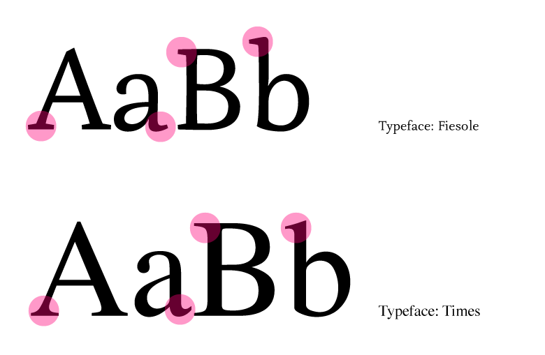
From these two samples you can see there are variances in different serif typefaces. There are many different serif typeface subcategories. Old Style is characterized by minimal line contrast and often the thinnest parts of letters (the stress) are at an angle. Transitional serifs are between Old Style and Modern. The Modern serifs have extreme contrast between thick and thin line strokes, think of the Vogue logo. A slab serif have heavy slab or rectangular serifs, often implying a stamp of approval. We will cover each of these serif sub categories in more detail in an another post.
A Look at Sans Serif Type
Sans Serif typefaces are clean with crisp lines, they do not have extending details called serifs or feet at the end of each stroke. The pink circles below highlight the lack of details at the end of each stroke. The sample sans serif fonts used below are Myriad (basic default Mac sans serif typeface) and Bunday Sans a new typeface designed by Buntype.
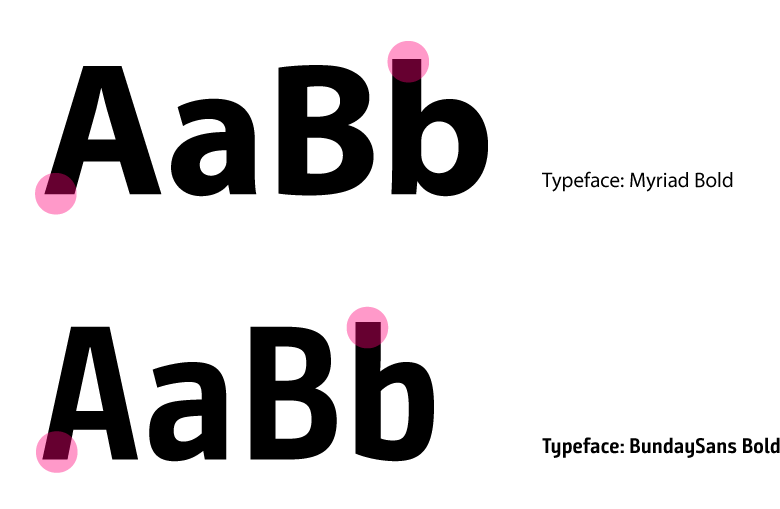
The stroke width of sans serif typefaces tend to me more uniform, with minimal contrast between thick and thin strokes. The stress is nearly always vertical. Some sans serifs are geometric, while others combine organic and geometric features. San serif typefaces are often used to convey modernism, simplicity, or minimalism.
Typography is all About the Details
When looking at different type options and pairings there are many details to compare. We consider the x-height, cap height, ascender and defender height, counter shapes, cross strokes, and ligatures just to name a few. It is also important to consider your client, their budget, and the cost of different typefaces. Additionally, is the typeface you have in mind available to use on the web? Does the typeface have a family of different line weights and styles that could be used to provide differentiation? It is important for a typeface to be versatile. A consistent typeface family needs be used across mediums and brand touchpoints.
If you enjoyed this post and would like to learn more about Blank Space. Please shoot me an email with any questions or sign up for our newsletter.