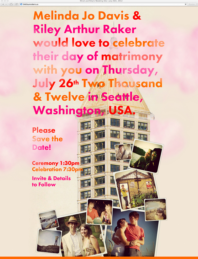
I just came across images of the save the date wedding website we made for ourselves back in 2011–2012. Obviously, Riley and I love working together and we had a ton of fun creating the website and invitations for our wedding. Being designers, we both have a strong opinion about aesthetics. The overarching design was a BIG DEAL for us. Luckily, our combined ideas are better than our solo ones. (Side note: I recently read and article about dating a designer on Yoke, and was thinking I should do a follow up about designers dating designers.) We wanted a colorful wedding that was bold and expressed our excitement and joy. The ceremony was held during the day at the Washington Park Arboretum—The Pacific Connections Garden—a lovely section of the park surrounded by our nearest and dearest and an abundance of nature. The evening celebration was at the top of Smith Tower, which is pictured in the save the date website image above. The site was designed with playful parallax scrolling, and the fluffy pink clouds drifted across the screen in-and-out of the typography and images. It was elegant yet fun. I’ll try to get some good photos of our invitation design and post them this week!
My advice for anyone out there working on their own wedding graphics is to simply slow down and enjoy the process.