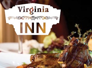
We are pretty excited about our first large restaurant gig. It includes a brand refresh, directing a photo shoot, and a website redesign.
Two concepts we presented to Virginia Inn this week for their initial brand refresh:
 Concept2: Understated Sophistication
A modern look to a historic restaurant.
Refined, Cultured, A personal touch
 Concept1: A direct translation of their neon sign.
Highlighting the lively atmosphere and references Old Seattle.
Dynamic and Energetic
It was close but we finally decided on a favorite. What’s your favorite?