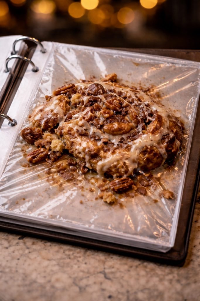
I had a dream last night that I was at a café with my wife. The waiter brought us the menu, it was about eight inches square and tremendously thick. I opened mine and flipped past the first few pages to the pastry section. Each page was a clear pouch containing the actual pastry.
The pastries were smashed and mutilated from being stuck in this odd book that was hustled around the café all day. I suspected some of the samples had been tasted.
“That’s a different way of doing it,” I thought, and made my selection (a pecan cinnamon roll).
It was a stupid dream, and I usually don’t think too hard about my dreams, even when I appreciate their weirdness. But this one got me thinking about graphic design and how I might represent things differently.
Why is stuffing pastries into sleeves for a menu a bad idea? It’s messy, not durable, difficult to update, expensive, and a bit gross.
Why is it good? It represents the thing completely. I could see the size, shape, texture, and ingredients. I could feel the weight, take a sniff, maybe even a taste. I knew exactly what I would be getting—even if I hoped it would look a lot better.
The biggest advantage is that it’s incredibly memorable. I wouldn’t forget that café anytime soon, and I’d definitely tell my friends.
As a designer, I often think about what to take away. How can I simplify data and concepts? This dream reminded me to also think about what I can add. Can I stuff something completely full? Can I make something that is so impractical that it works better than the concise solution in a surprising way?