I love using the classics—Helvetica, Frutiger, Gill Sans, Garamond,, etc.—but I need typefaces that are designed for print AND the screen. Many of the classics are not available for web use. I want typefaces optimized for screen readability and legibility. Whenever I am starting a new identity or logo design project, I keep in mind if a typeface has a web font. It isn’t a deal breaker (yet), but it is a high priority.
Part of my job as a graphic designer is to help our clients present themselves with a clear consistent image. A typeface contributes to your personal brand, company, or organization’s tone-of-voice. Consistently using the same font, whether that is your website, logo, or brochure, it builds your image and a sense of trust and reliability.
I am researching many of the new web typefaces available. There is a lot of clutter, but there are some solid options.
The first typeface winner I want to share with you is Glober.
Glober hails from Fontfabric, an independent type foundry, launched by designer Svetoslav Simov based in Sofia, Bulgaria. His goal is to create high-quality fonts which stand in a unique class of their own, and which will serve as a good base for any design project whether it be web, print, t-shirt design, or logotype.
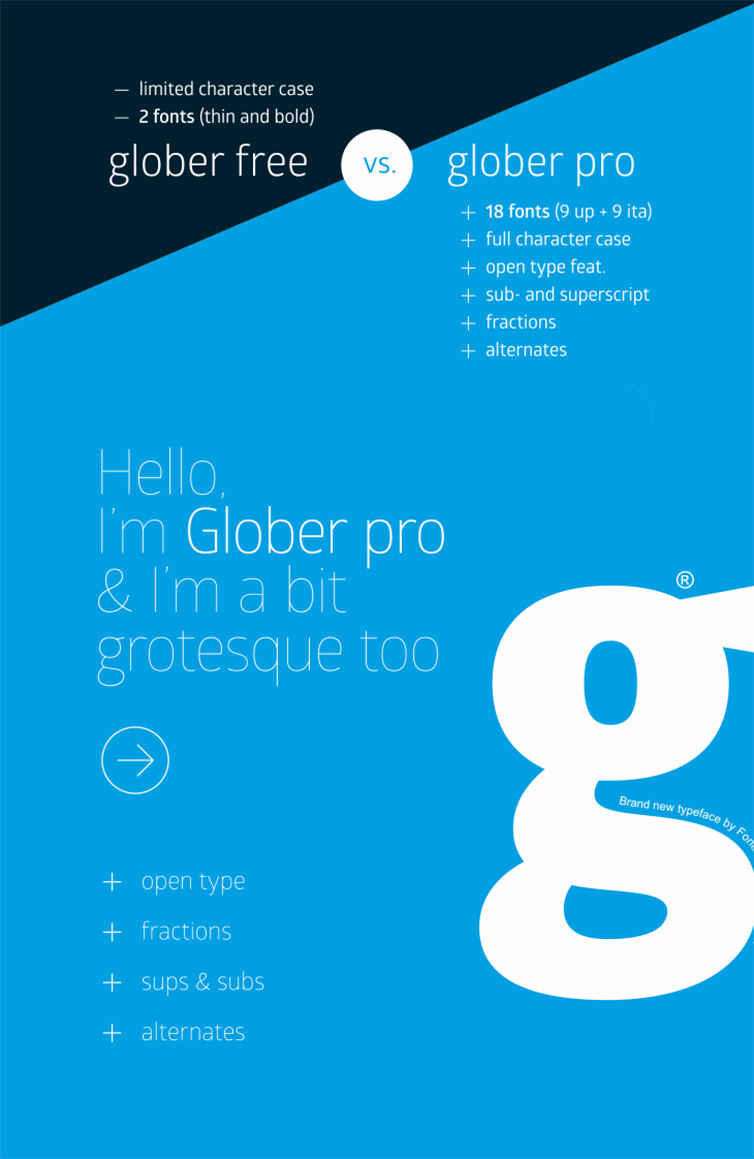
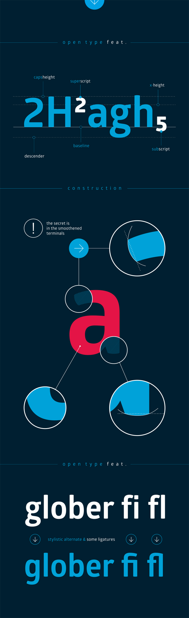
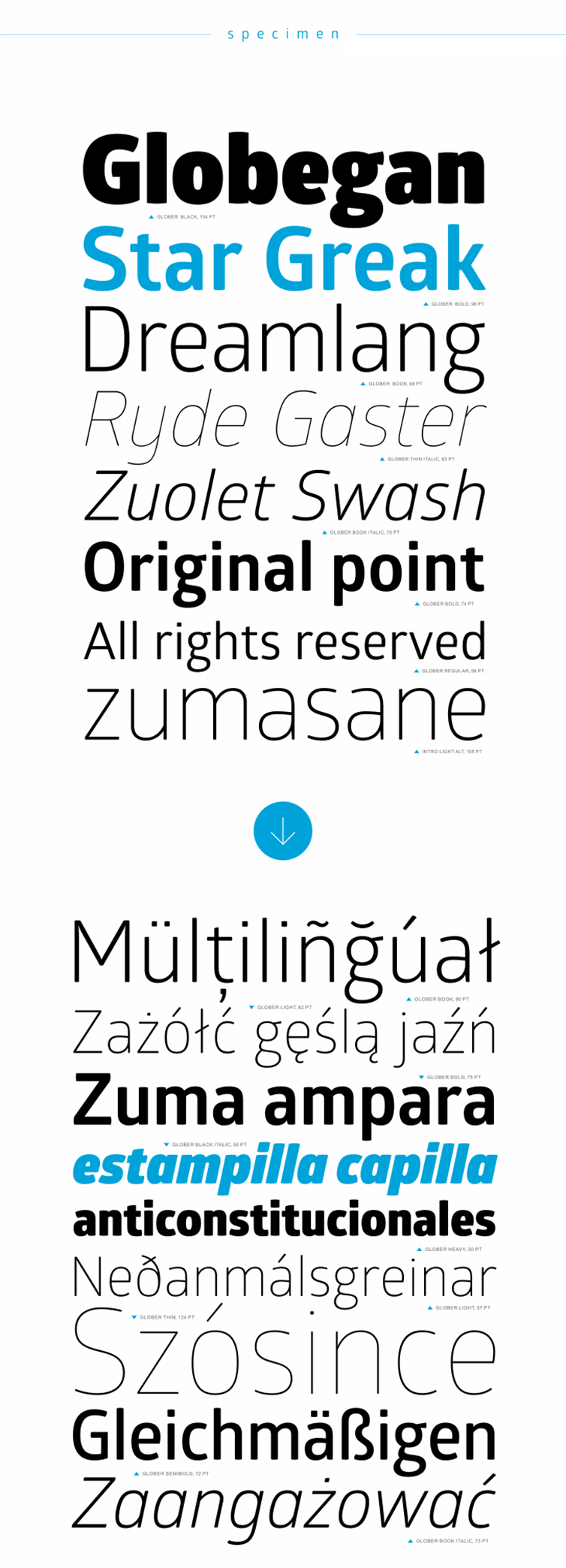
The Glober family includes 18 weights, including true italics. The range from thin to heavy makes me smile. It has excellent legibility. Inspired by the classic grotesque typefaces, but Glober has his own unique style. Its softened geometric forms creates a structured and friendly appearance. You can buy Glober on You Work For Them. The light and bold faces are available for free at Font Fabric. (Released February 2014.)
I hope you enjoy Glober as much as I do.
Typeface Winners is a new blog series. These are new typefaces I think will become the classics of typography on the web. We are no longer limited to Arial, Verdana, Times, and Georgia. Let’s create an internet where beautiful typography is the norm and not the exception. Do you have a web font that you love to use? Please send it my way.
P.S. We are currently working on updating our own website design to keep up our end of the deal.